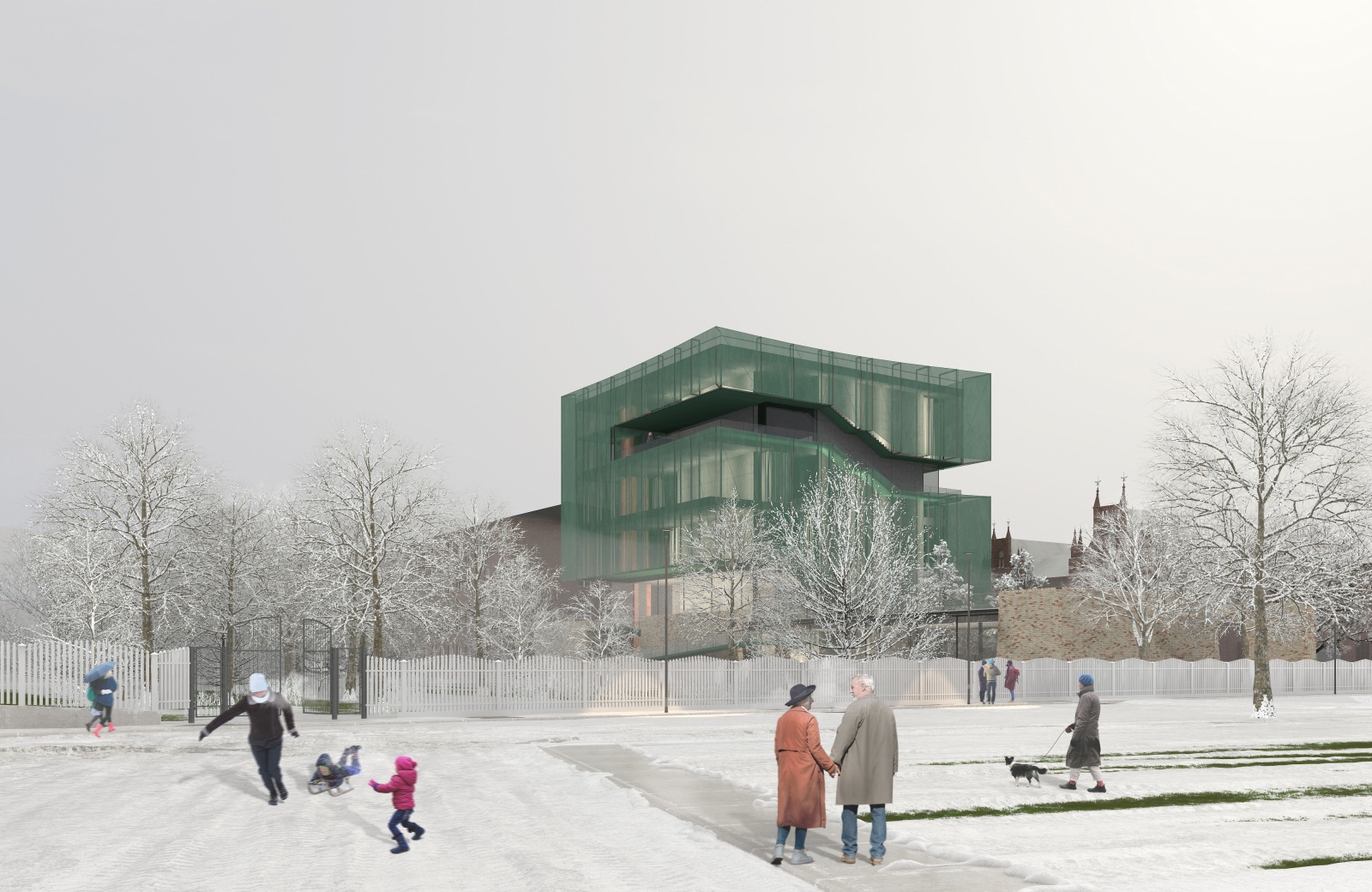
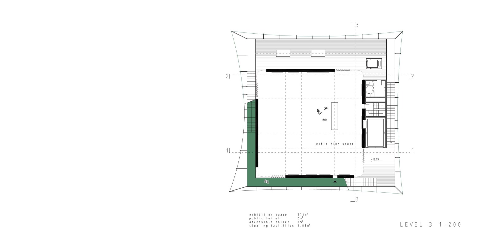
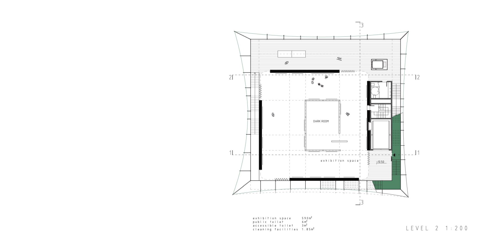
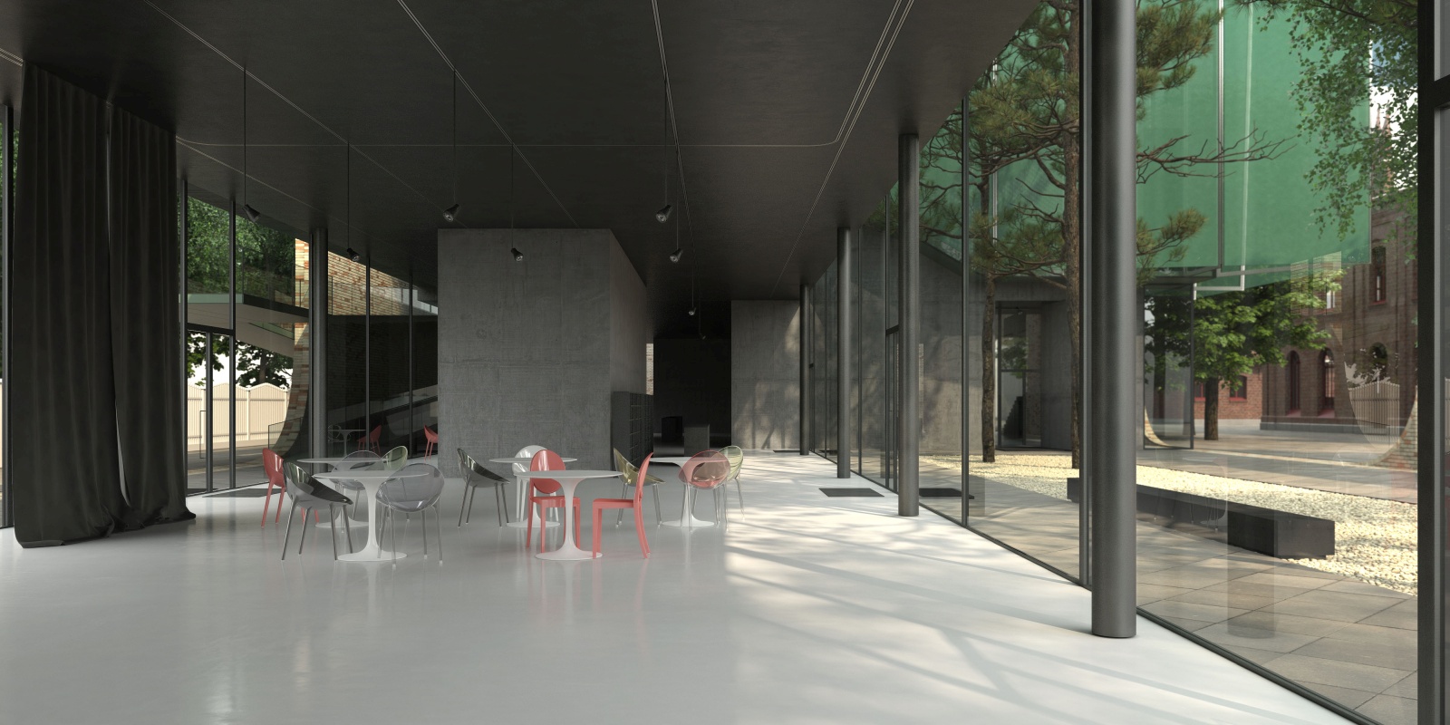
The idea of designing the new Sara Hildén Art Museum building within the Finlayson old industrial area, the very heart of the city of Tampere, means redefining the notion of a museum as a presumably introverted structure, mainly focused on showcasing and exhibiting the works within, to a state-of-the-art panoramic viewpoint that overlooks the entire Finlayson area and beyond, and includes within the exhibition route the actual living city itself. Situated at the former west entrance to the textile factory complex, on the very border between the industrial buildings and the public facilities that were built to support it – the factory owner’s palace and its garden, now a public park, the church and the former post office - the new museum building seeks to establish a link between the ephemeral exhibition contents inside and the precious built heritage of the city around.
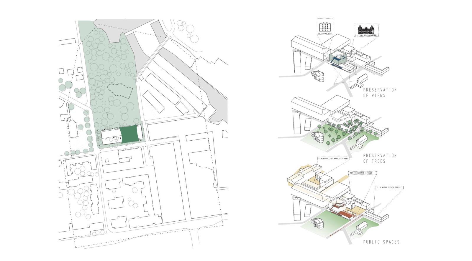
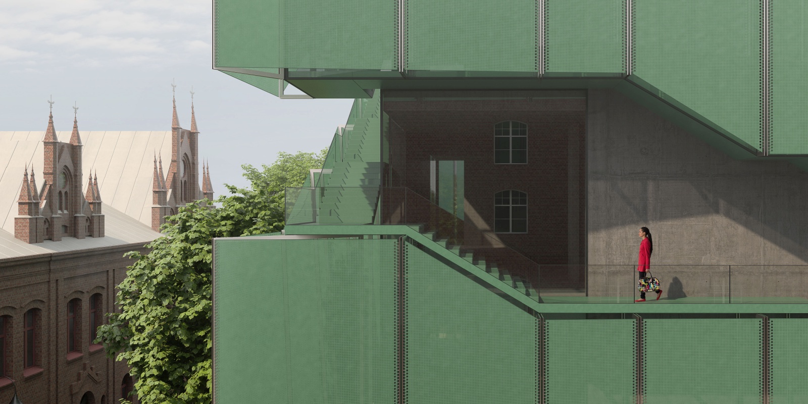
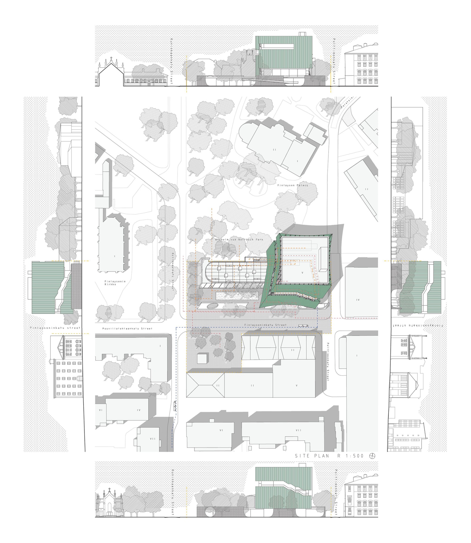
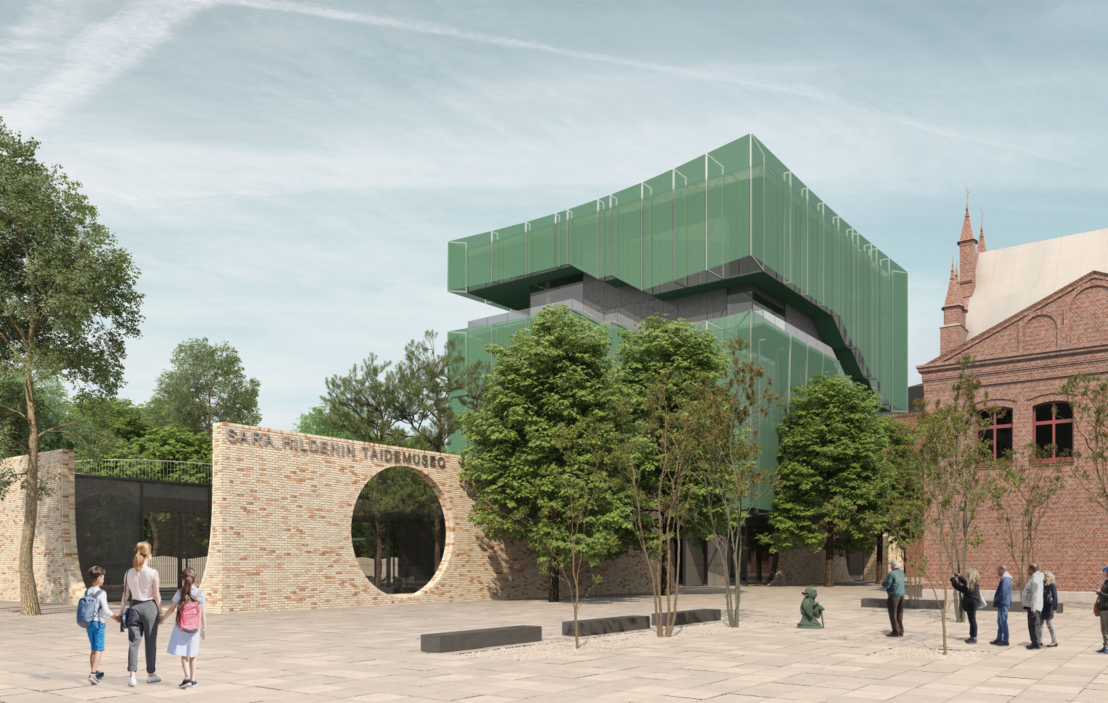
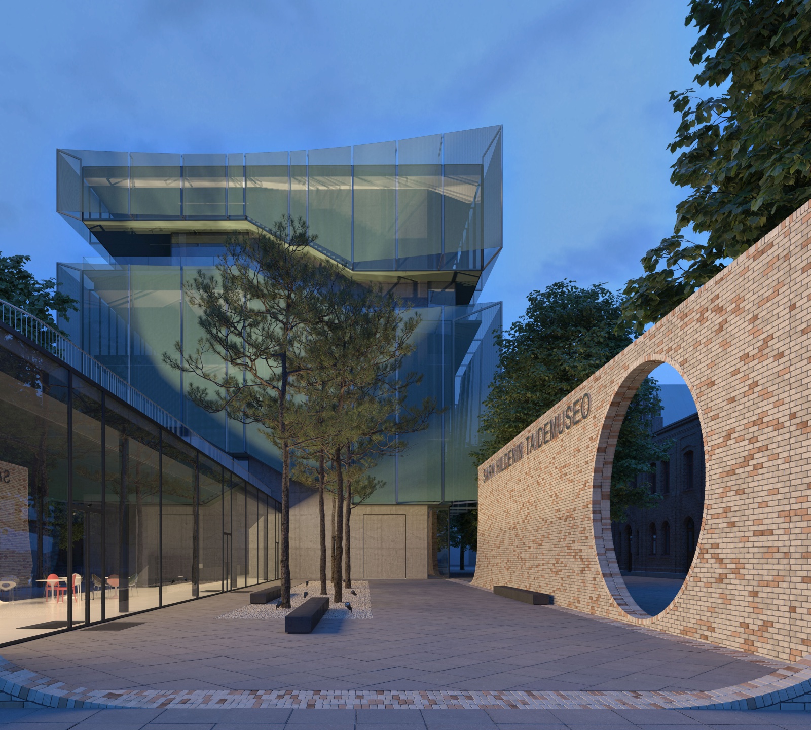
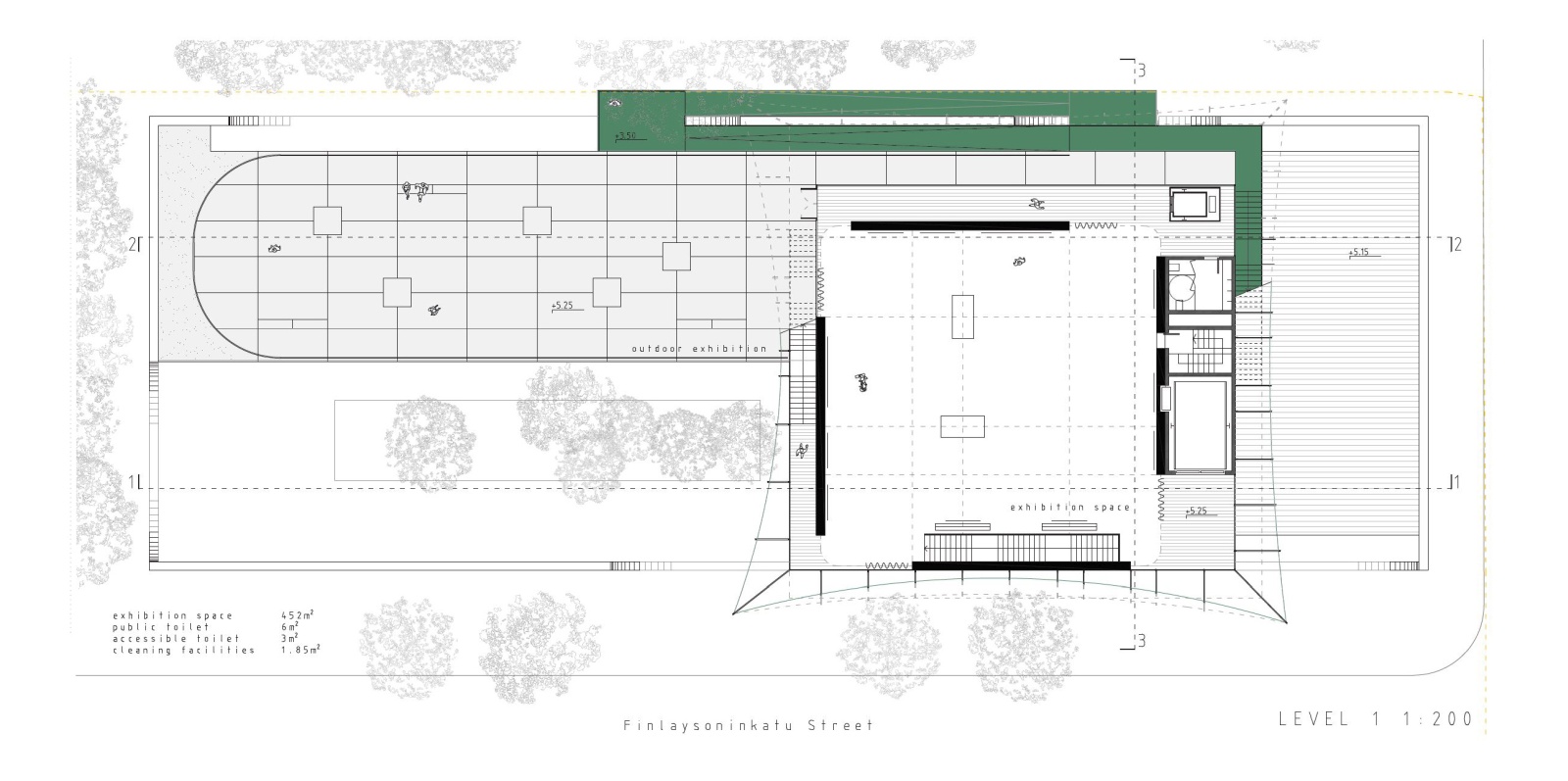
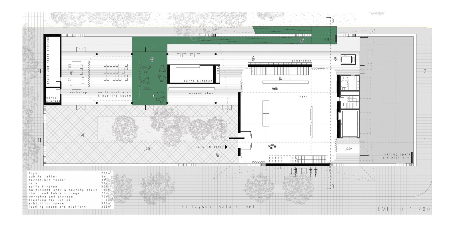
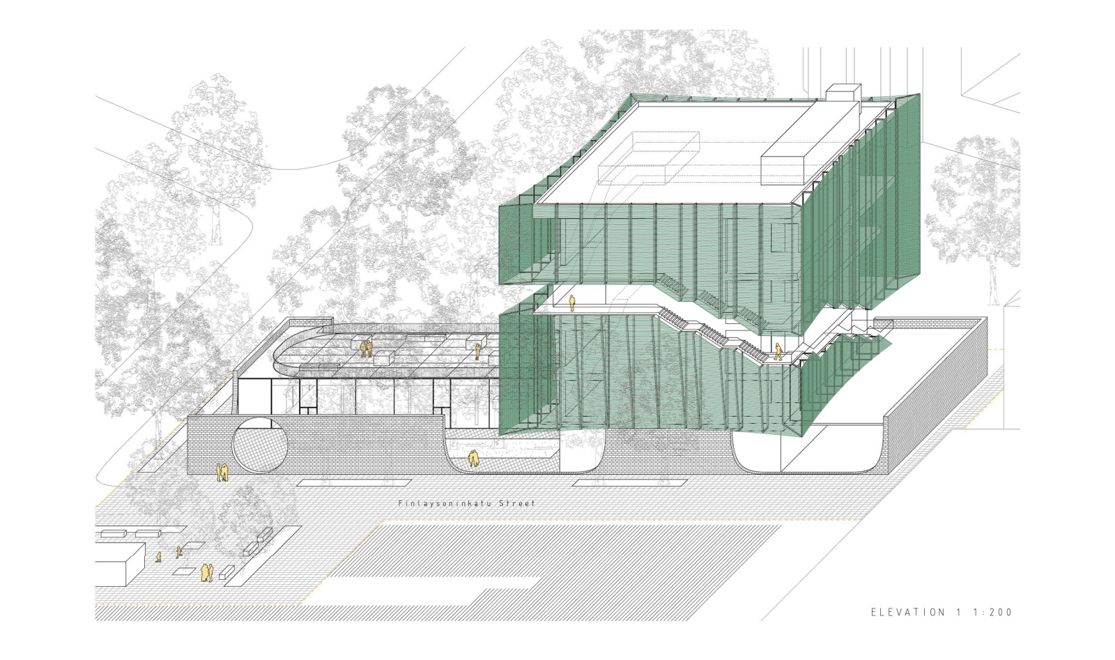
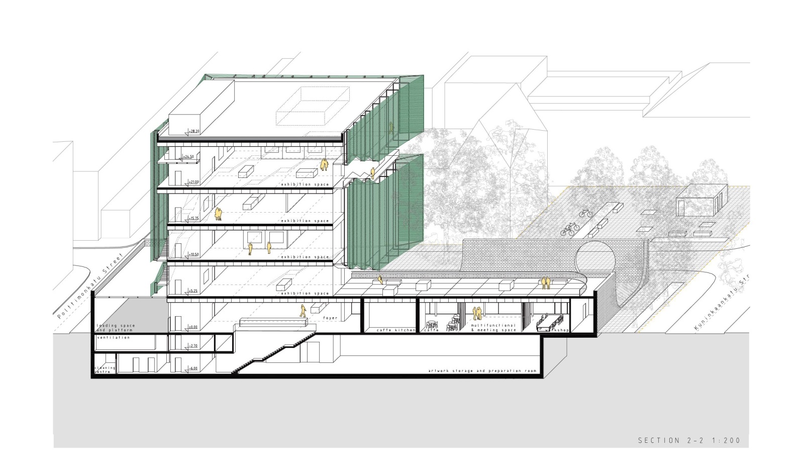
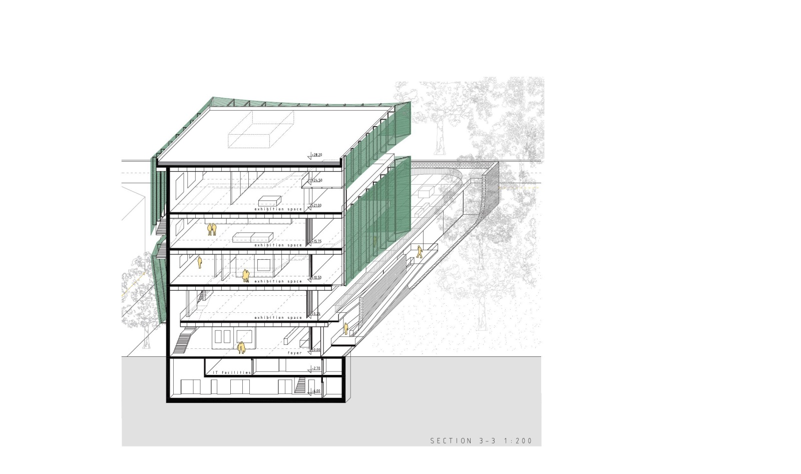
The museum is composed of two volumes that take up the side of the plot bordering the park, allowing for a small public gathering square by the factory headquarters buildings. One volume houses all main public facilities, it is elongated and low, sublty immersed in lush greenery, so that it preserves and protects all trees found on site. It opens directly towards Finlaysoninkatu Street, Kuninkaankatu Street and to the Wilhelm von Nottbeck Park, and houses an open exhibition terrace on its roof. The other volume holds the exhibition spaces, it is large and compact, elevated above the ground floor and carefully positioned so that it still allows views from all public spaces around, the park, streets and squares, so that while approaching the museum one has an immediate sense of its precious surroundings that are its integrated part. Images of the industrial buildings, the greenery and the new museum all constantly overlap and blur within each other. Exhibition spaces are large, simple and clear, with flexible partitions allowing for a number of different exhibiting options, while the visiting route is pushed to the outer perimeter to protect the exhibition inside, as well as to allow views from the inside towards the city.
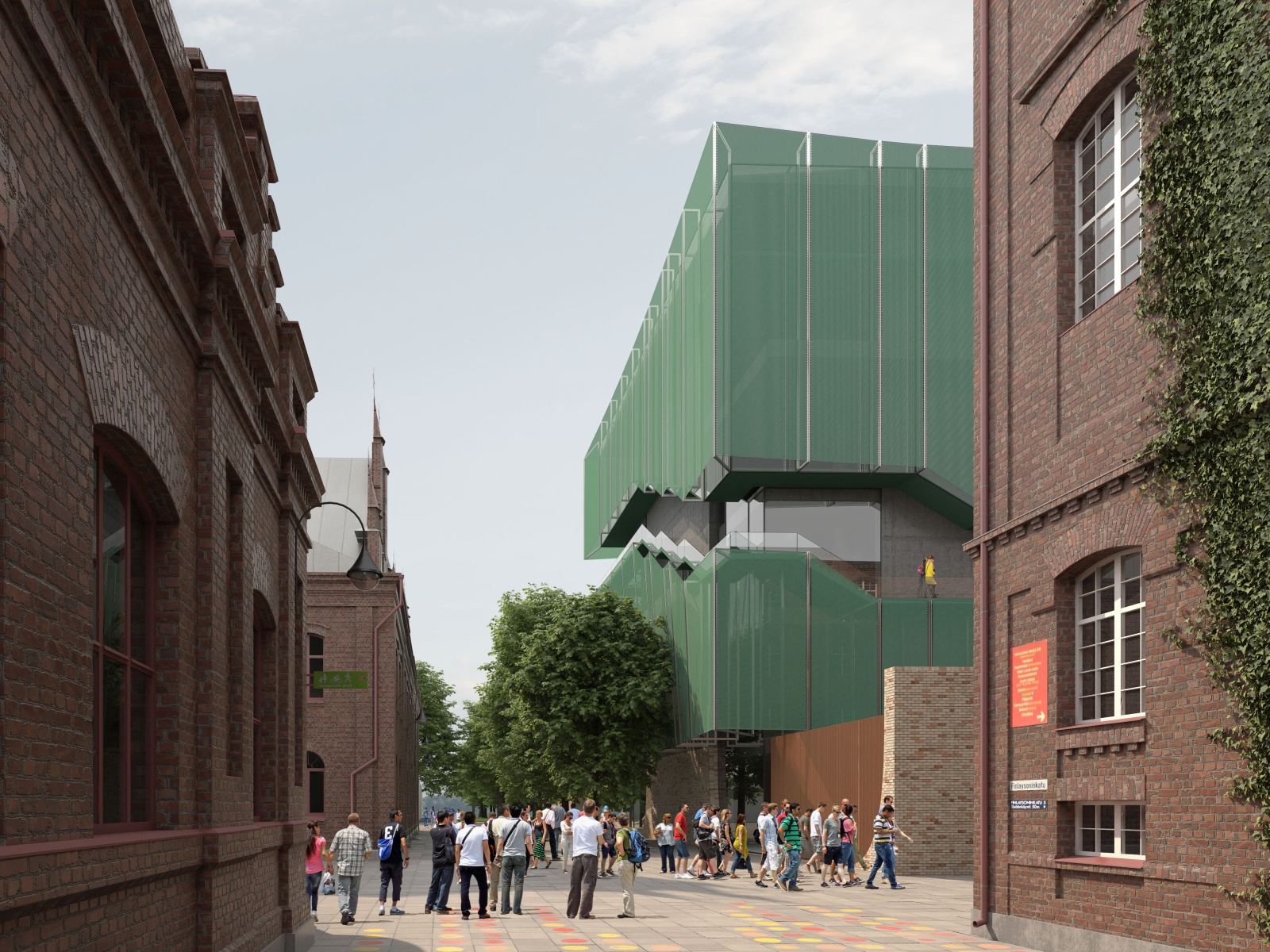
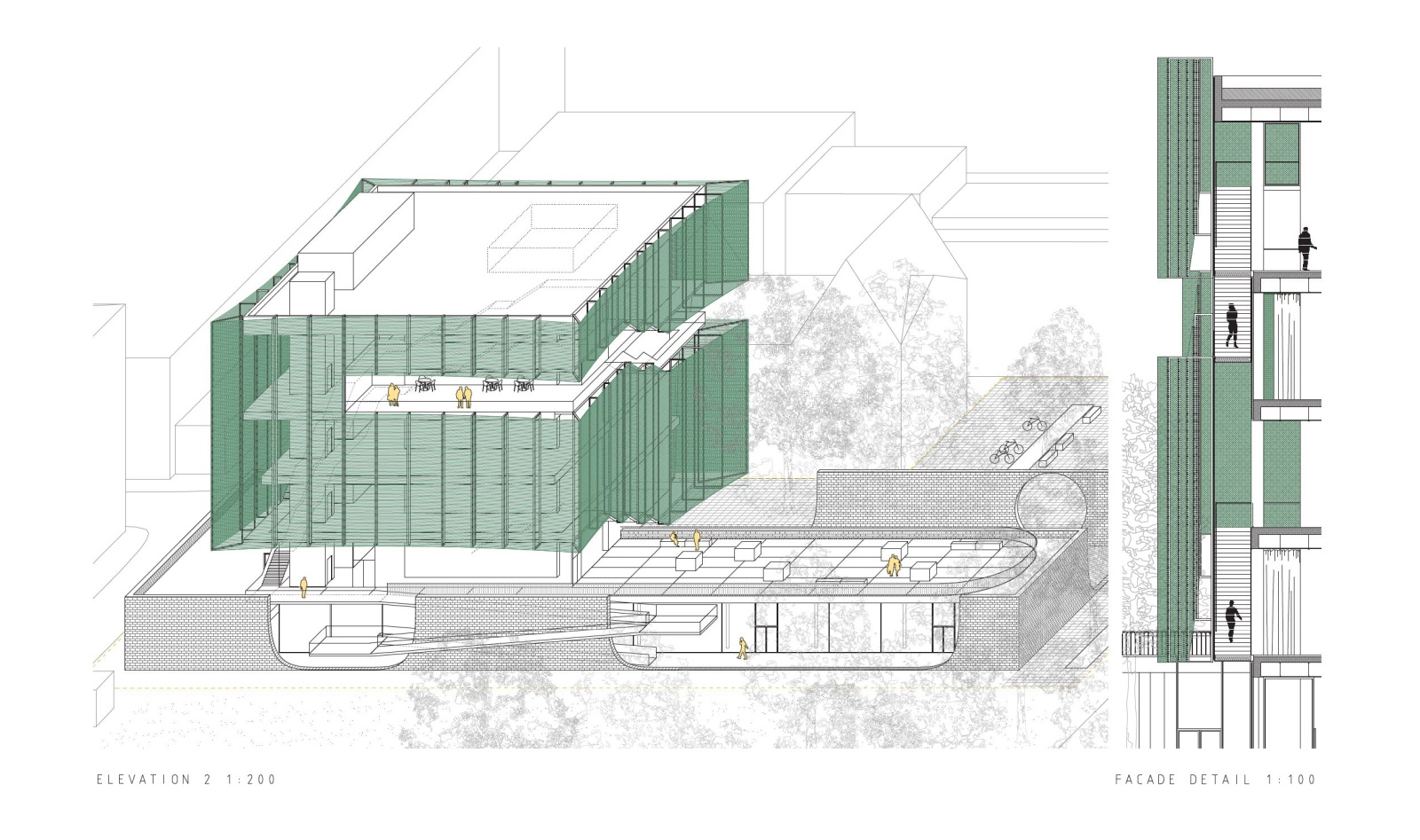
The main exhibition volume is lifted and light, enveloped in diaphanous fabric that permits filtered views both from the city inside, as well as from the interior space towards the city. The fabric acts as a buffer layer protecting the fragile works of art by dispersing direct sunlight into a sage green luminous fog inside. On the outside it appears light and airy, blurring the views during the day, and glowing at night. The idea of a textile façade stems from the Finlayson area and the city of Tampere cotton factory origins, as well as Sara Hilden’s personal vocation in fashion industry. Light textile volume of the museum is sensitively integrated within the cityscape to form a new city landmark, rising above the historical buildings and the trees of Wilhelm von Nottbeck Park. With its lightness it doesn’t impose on the red-brick industrial buidlings around, but builds on the strong identity of the Finlayson area, adding it a new contemporary note. In contrast, the ground floor volume is bordered by a beige brick wall, carefully constructed to form a dialogue with the surrounding buildings and to frame views towards them. The crafted details of rounded lines correspond to the meticulous rich details of red brick Neo-Gothic facades of the factory headquarters neighboring the site.
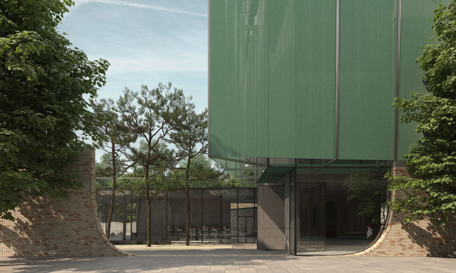
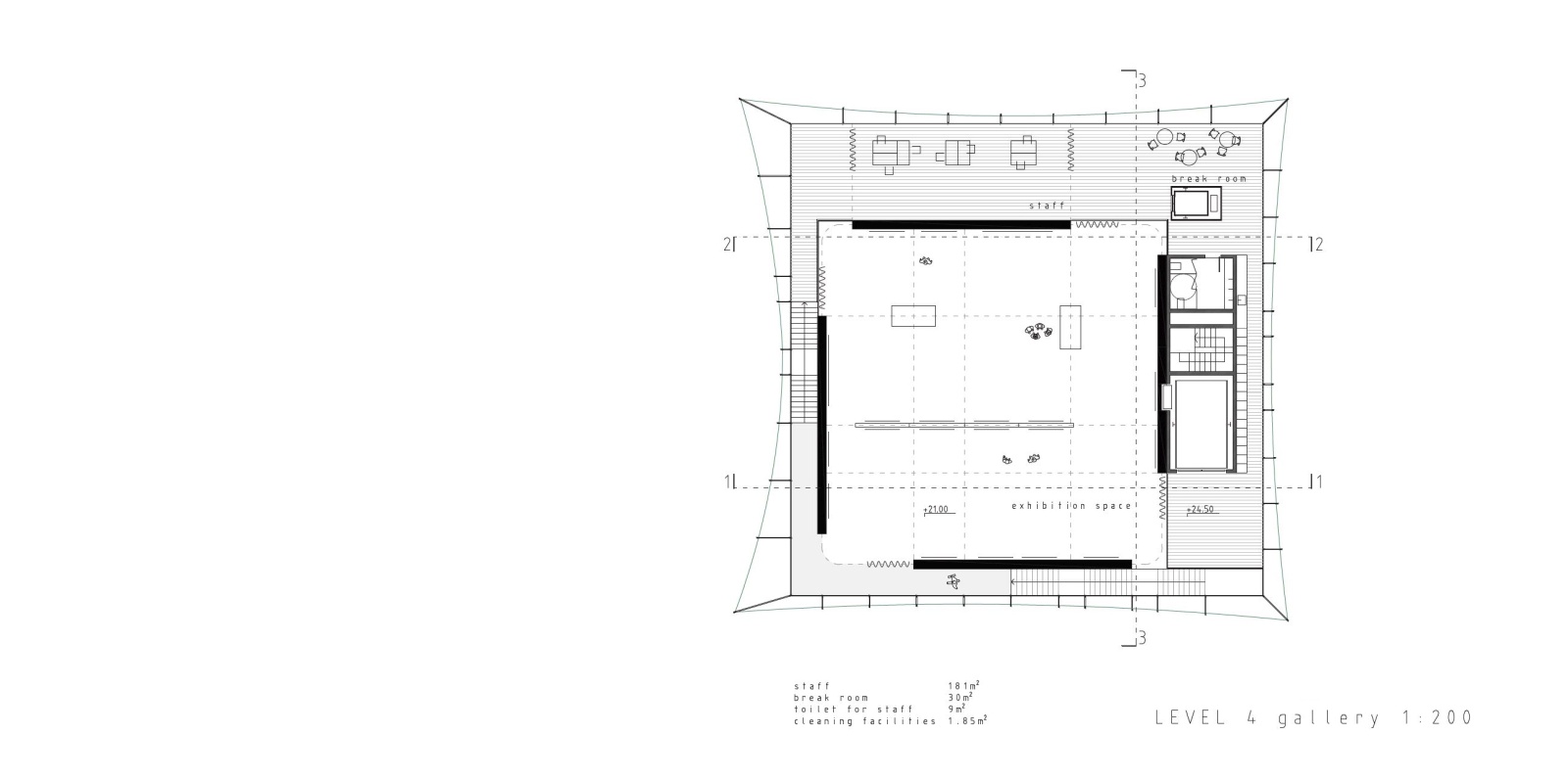
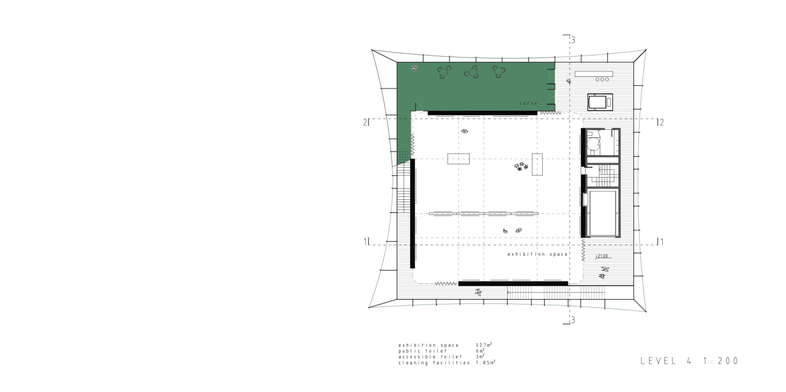
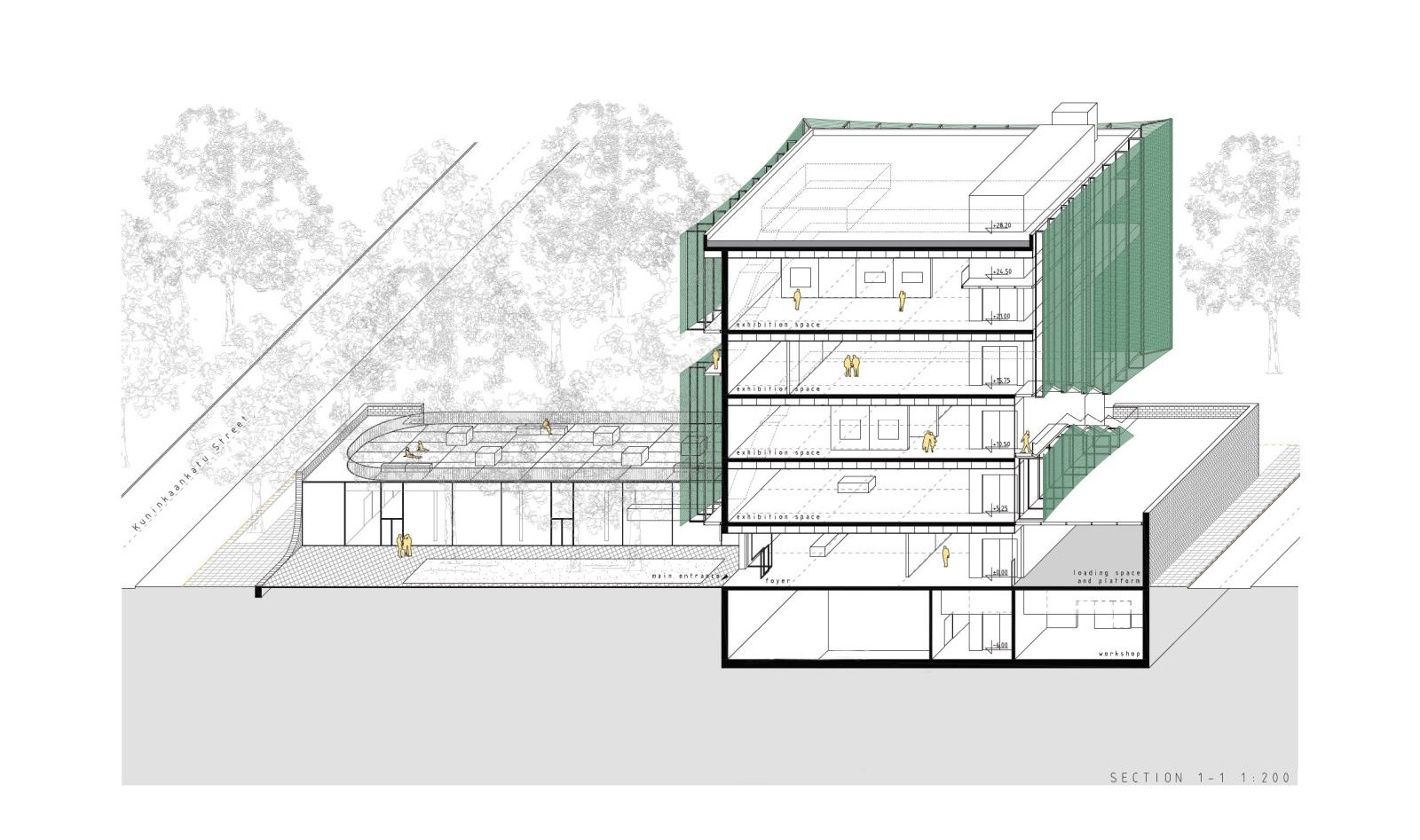
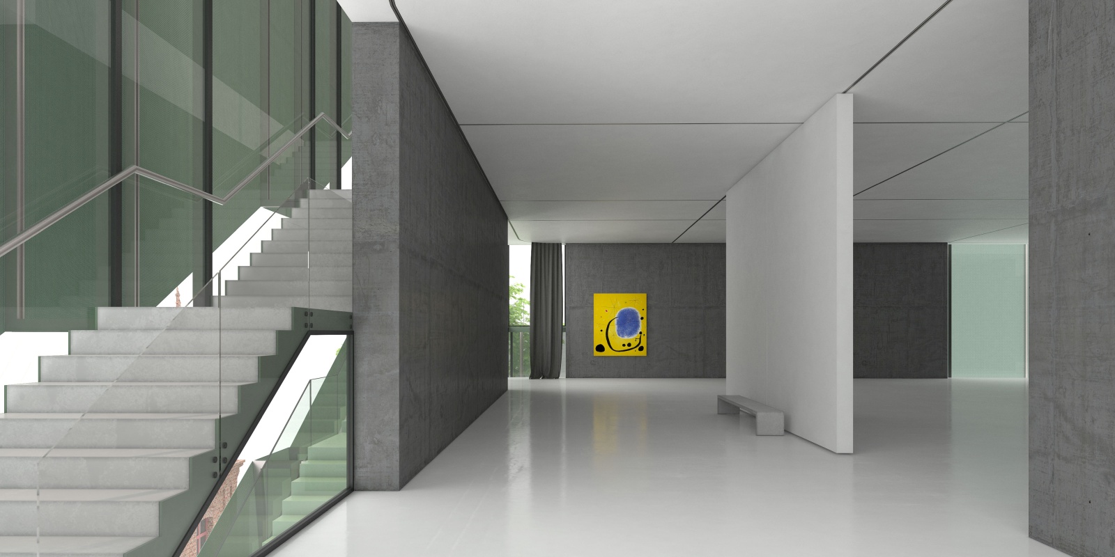
The visiting route is an enclosed circle, designed to encompass the entire museum along with the open public spaces around. It starts with the small public gathering square and the protected courtyard, from where one enters a large museum foyer that holds some of the exhibition spaces. The route than continues with the enclosed perimeter staircase, gradually evolving the building and taking the visitor to the four exhibition floors above. This route is enclosed with glass and fabric façade layers, and showcases glimpses of the city to the visitors while ascending. All exhibition floors hold two types of exhibition galleries. The central large square gallery is protected from daylight, and can be completely enclosed with curtains, while the elongated gallery on the side of the park is open to the facade fabric and glazing layers, offering subtly blurred views towards the park, and always lit with filtered daylight from the north. The interior exhibition route ends with a small terrace overlooking the entire Wilhelm von Nottbeck Park where one can relax for a moment, grasp for some fresh air and have a cup of coffee.
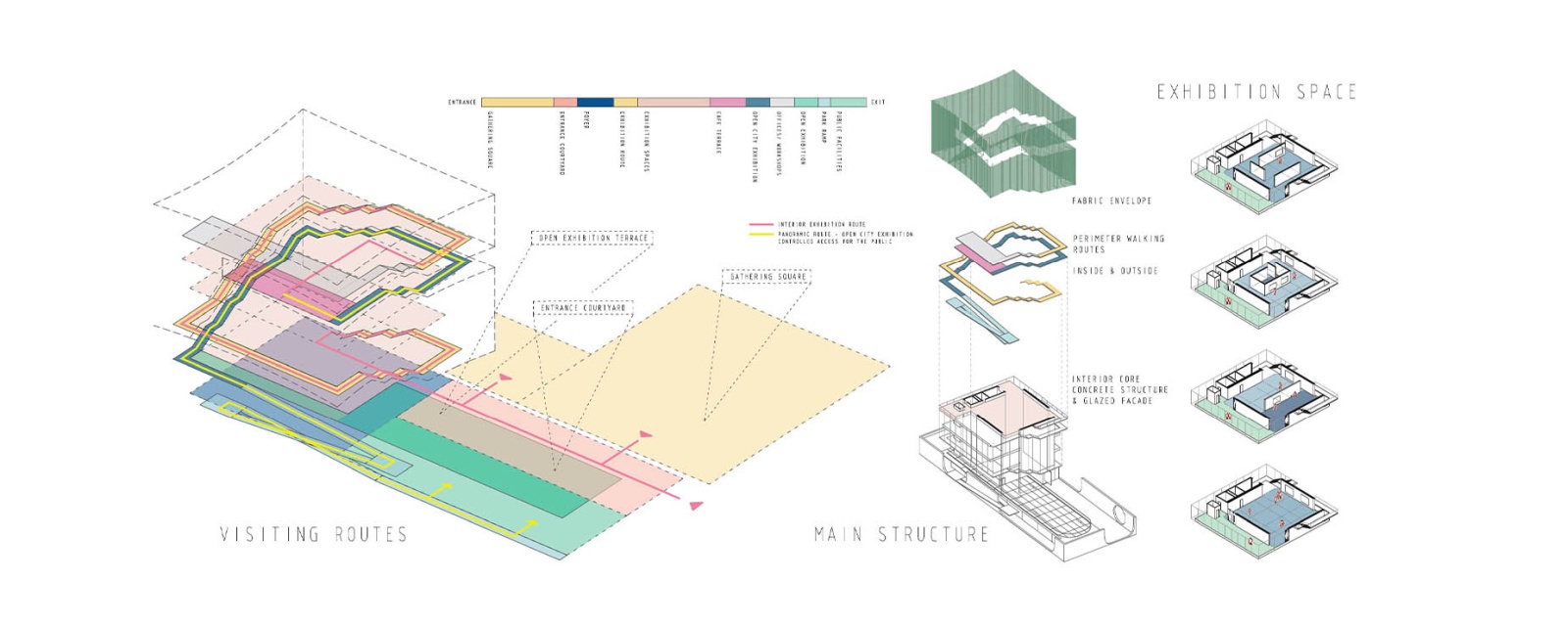
From this point the route continues on the outside with an open staircase gradually descending around the building, and showcasing the entire Finlayson area and its industrial heritage from above the tree crowns. This panoramic route offers the visitors new points of view towards the industrial buildings, the parks, the Tammerkoski rapids and beyond, and integrates fully the museum experience with the city of Tampere. The outdoor route ends with an open exhibition on the ground floor roof terrace at the height of the tree crowns. From here, a long ramp at the border of the park leads the visitors towards the point of entrance to the museum public facilities – the café, shop, multifunctional space and workshop that all open towards the entrance courtyard, this way completing the visiting route. The outdoor panoramic route is in this way open to the public when the museum decides so, so that one can climb the building from the park towards the open exhibition on the lower roof, and to the café terrace on top floor, for example during open museum days. This way, the museum can offer the city of Tampere a rich gradient of different public and semi-public spaces - from the park, pedestrian streets and squares to the open exhibition roof terrace, and if decided as such, even to the viewpoint terrace on top.
To allow views and at the same time to protect the exhibition, we created a multiply layered envelope by distancing the main concrete structure, glazed surfaces and outer layer of stretched fabric. The galleries are at the heart of the floor plan, protected by four structural concrete walls, while the main visiting route is pushed to the outer perimeter of the plan, between the concrete structure, glass and textile fabric. The envelope is sliced continuously on its outer perimeter to hold the exterior panoramic route.
The building is designed to be easily maintained, as well as to respond well to all changes in daily routines and even main functions. The textile façade protects the inner layers from decay, direct sunlight and elements, and it is easily cleansed and affordably changed if needed. The supporting structure of the fabric offers easy access to the entire inner and outer layers of the façade for cleaning and repair. All floor plans are clear of partitions, large and open, allowing for a multiplicity of different use scenarios.
